
Ember Electrical Case Study
Client
Self-Directed Concept
Timeline
2 Weeks
Services
Brand Identity & Style Guide
Live Site
Not Applicable — Concept Project
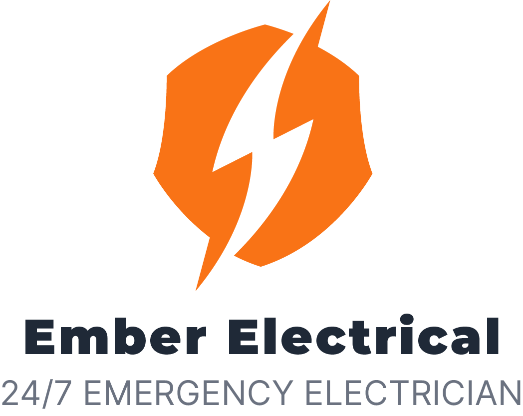
Building a bold visual identity for Ember Electrical
Ember Electrical is a concept identity created for a modern electrical contractor. The objective was to develop a bold and dependable brand that communicated energy, safety and professional workmanship.

Challenge
Electrical-service identities commonly rely on familiar lightning symbols and high-energy colours. The challenge was to produce an immediately relevant mark while maintaining a clean, modern and professional appearance.

Approach
The identity combines a simplified lightning form with a compact geometric enclosure. A high-visibility orange was paired with charcoal and neutral tones, creating a flexible system for print, digital communication and trade applications.

Outcome
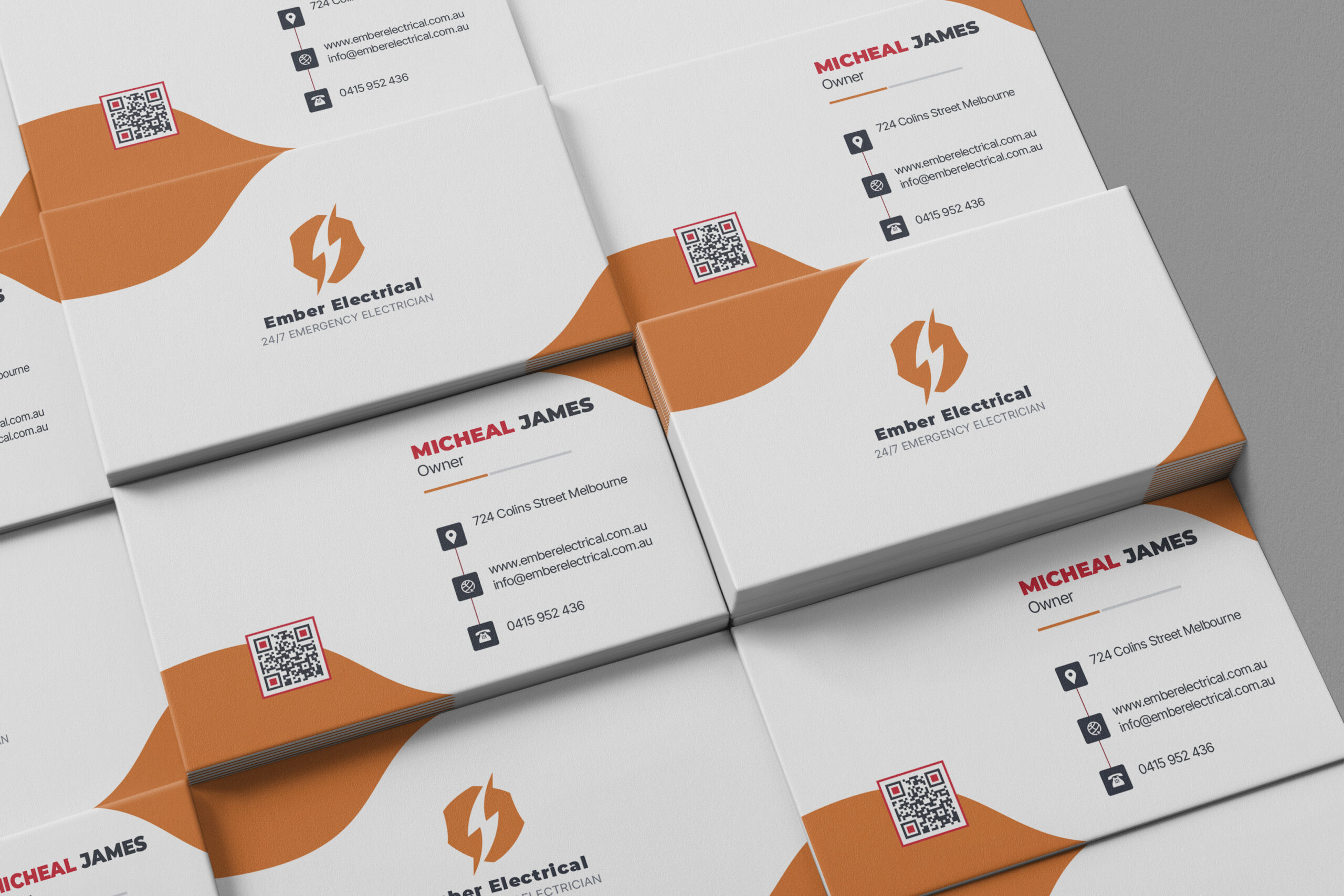
The final identity includes a primary logo, compact mark, colour system, typography guidelines, business-card application and ten-page brand guide.
Key Design Decisions
- Orange accent for energy and visibility
- Compact logo mark for small applications
- Heavy typography for dependability
- Neutral supporting palette for professionalism
- Consistent visual system across the guide and cards
Recent Projects
Future Focused, Project Proven
Polymath – Creative Brand Guidelines

Spherule – Creamy Matcha Tube Mask